

Toma Harmelink

What is manga?

Manga is a form of Japanese comics that are aimed at both adults and children and are read from right to left. Some titles that you may have heard of include Dragon Ball, Naruto, and Chainsaw Man.
It is a dominant force in North American graphic novel publishing, accounting for 54% of total graphic novel sales and expected to grow by 17% from 2023 to 2030.
What does the current manga app offer?

The Shonen Jump manga app is the official source for users to read the world’s most popular manga. In the app, manga can be read, digitally purchased, and downloaded. New chapters become available once they are translated into English, meaning weekly releases at the earliest!
Shouldn’t the world’s best-selling manga magazine have the world’s most used manga app?
Challenge:
Although boasting a 4.8-star rating on the Google Play Store, the Shonen Jump Manga & Comics App leaves users finding it difficult to fully enjoy their reading experiences due to the app's lack of customizable reading features.
Solution:
An intuitive interface that allows for personalization of the user's reading experience, as well as the addition of essential app features.
RESEARCH
COMPETITIVE ANALYSIS
To begin, I completed a competitive analysis to profile Kindle, one of the most popular e-readers, Manga Plus, another well-liked manga app, and Line Webtoon, a prominent Korean webcomic reader. This would help me understand existing navigations and features for a manga app.
Pros:
Abundance of customizable reading features for text-based books
UI has great flat look, navigation is intuitive and icons include text descriptions

home screen and ‘Hot’ tab are easy to navigate on first use
more reading options such as tap to turn page

very scannable dark mode
content options are vast but well-organised, didn’t feel overwhelmed

Cons:
home screen feels cluttered
lack of logo and brand identity
reading features only include vert/horiz view mode and image quality changes
numerous ads could be reorganized into a carousel
(update: ads are now in a carousel)
tabs and sheer amount of content can be overwhelming for new users
lacks reading features but app builds around the vertical format of most webtoon series
Full competitive analysis


USER INTERVIEWS

I interviewed three regular users of the Shonen Jump App using open-ended questions to allow them to voice their experiences, which aligned with the feedback expressed in the app’s Google Play Store reviews. A common sentiment from the interviews was that they read from the Shonen Jump App for its official translations but not because of its reading features.
Most of the interviewees answered that they read manga on other sites due to their abundance in reading features, not being restricted to one publisher’s catalog, and having quicker release windows.
I also received feedback from these users about my possible changes to the app throughout my design process.
APP REVIEWS
At First Glance
As I read through a total of 224 Google Play Store reviews ranging from 1-3 stars, I kept a tally of user’s complaints and created post-its using Miro. These were grouped into the three categories of UX, General, and Technical.
It was apparent that other than explaining the app’s bugs, the users believed the app lacked both essential and supplementary reading features.

Exploring before Committing to Changes
Focusing in on the UX changes, I grouped the reviews into categories . Not only did the users require settings to tailor to their own needs but also navigation and menu options as well.

As a result of the research…
Narrowing it down to 3 design improvements
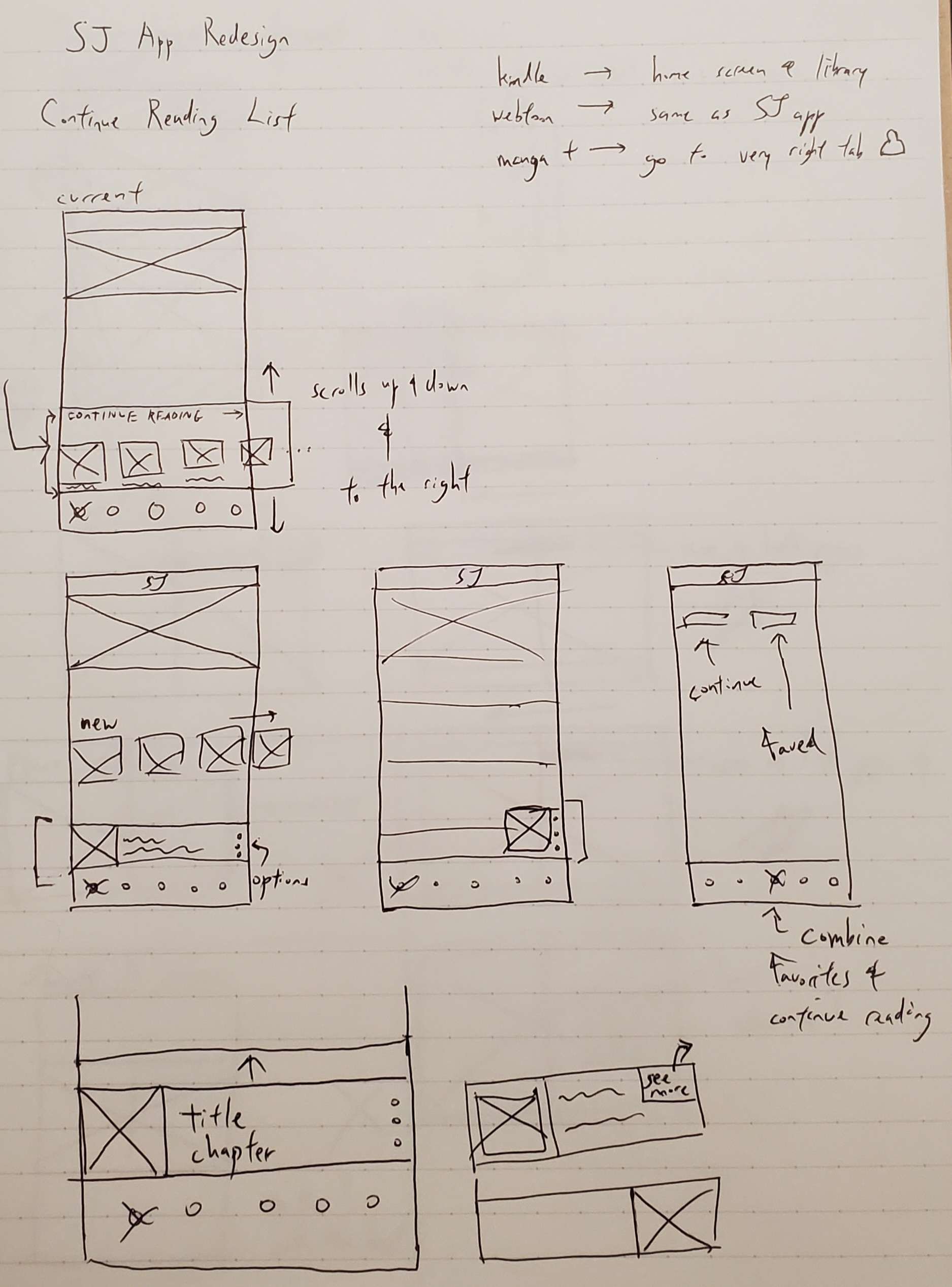
A fleshed out continue reading list to get readers right back into their favorite reads!

Most users will return to the app to continue where they left off. This section of their app experience needs to be well-polished.
A two-page spread view for the most impactful scenes in every manga series!

In my own reading experiences, reading half of a full-page spread often ruined some big moments in series as I would read the page only to discover half of the text and art were cut off.
Navigation improvements as well as user-friendly menu options!

Apps such as Kindle and Webtoon had lots of content to show while not making the user feel overwhelmed. However, the Shonen Jump app feels as though it lacks content due to the big size of thumbnails used for each series.
RESEARCH
COMPETITIVE ANALYSIS
To begin, I completed a competitive analysis to profile Kindle, one of the most popular e-readers, Manga Plus, another well-liked manga app, and Line Webtoon, a prominent Korean webcomic reader. This would help me understand existing navigations and features for a manga app.
Pros:
UI is very clean and simple due to flat look
navigation is intuitive and icons include text desciptions
home screen and ‘Hot’ tab are easy to navigate on first use
more reading options such as tap to turn page
very scannable dark mode
content options are vast but well-organised, didn’t feel overwhelmed
Cons:
home screen feels cluttered
lack of logo and brand identity
numerous ads could be reorganized into a carousel
(update: ads are now in a carousel)
some wording on UI isn’t intuitive
tabs and sheer amount of content can be overwhelming for new users
Full competitive analysis
USER INTERVIEWS
I interviewed three regular users of the Shonen Jump App using open-ended questions to allow them to voice their experiences, which aligned with the feedback expressed in the Google Play Store reviews.
I also received feedback from these users about my possible upgrades for the app throughout my design process.
APP REVIEWS
At First Glance
As I read through a total of 224 Google Play Store reviews ranging from 1-3 stars, I kept a tally of user’s complaints and created post-its using Miro. These were grouped into the three categories of UX, General, and Technical.
It was apparent that other than bugs with the app, the user’s consensus was that the app lacked both essential and supplementary reading features.
Exploring before Committing to Changes
Focusing in on the UX changes, users reviews were grouped into similar categories. Not only did the users require settings to tailor to each individual’s needs but also navigation and menu options as well.
As a result of the research…
Narrowing it down to 3 design improvements
A fleshed out continue reading list to get readers right back into their favorite reads!
Most users will return to the app to continue where they left off. This section of their app experience needs to be well-polished.
A two-page spread view for the most impactful scenes in every manga series!
In my own reading experiences, reading half of a full-page spread often ruined some big moments in series as I would read the page only to discover half of the text and art were cut off.
Navigation improvements as well as user-friendly options!
Apps such as Kindle and Webtoon had lots of content to show while not making the user feel overwhelmed. However, the Shonen Jump app feels as though it lacks content due to the big size of thumbnails used for each series.
REDESIGN PROCESS
WIREFRAME SKETCHES
Main Navigation


Two-page spread view
Continue Reading list
MID-FI WIREFRAMES
Main Navigation
Home
Search
Settings/Account


Continue Reading List
Collapsed list
Expanded list


Reading list options
Reading alert
Two-page spread view
Second page
First page


(Reminder: manga reads from right to left)
Double page view
Reading features


Favorites v. 2
Favorites v.1
Comic Page v. 2
Comic page v.1


HI-FI WIREFRAMES


POTENTIAL METRICS

Users
Measuring KPIs of users who regularly use new features such as the ‘Continue Reading list’.
Gauging user’s new experience through in-app surveys.
Monitoring user complaints in Google reviews post-update.

Business
Creating accurate definitions for ‘active users’ and monitoring the number of paid users as new features roll out.
SJ Manga app can pull ahead of competitor’s manga apps/sites by listening to its users, leading to higher NPS (Net Promoter Score).
REFLECTIONS
My primary challenge revolved around the process of addressing user pain points. It quickly became clear that I should have focused on changes that would yield the most significant impact on the overall user experience, rather than attempting to fix every reported issue. This could be completed through innovative new features, such as the two-page spread view, and regular quality of life updates.
I hoped to be able to conduct a more diverse usability testing from a much wider range of people beyond my circle of friends. Gathering opinions on my redesign that are more varied and without personal bias would have been ideal.
In the end, I’m proud of the solutions I came up with and believe that they would result in making both the manga and app more enjoyable!
Thanks for reading!
You can reach me at tomaharmelink@gmail.com :)
©2023. All Rights Reserved to Toma Harmelink.